[av_image src=’https://kessleronart.com/wp-content/uploads/2018/07/carolina-shed.png’ attachment=’147′ attachment_size=’full’ align=’center’ styling=” hover=” link=” target=” caption=” font_size=” appearance=” overlay_opacity=’0.4′ overlay_color=’#000000′ overlay_text_color=’#ffffff’ copyright=” animation=’no-animation’ av_uid=’av-jp4n4b1n’ custom_class=” admin_preview_bg=”][/av_image]
[av_textblock size=” font_color=” color=” av-desktop-hide=” av-medium-hide=” av-small-hide=” av-mini-hide=” av-medium-font-size=” av-small-font-size=” av-mini-font-size=” av_uid=”]
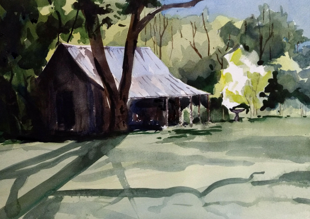
The objective in this painting was three fold:
- Connecting the darks, and trying to get some drama from the long shadows
- Work with a limited palette hoping to encourage the integrity of the picture
- Get a reasonable punch out of the small tree on the right, the main point of interest in the painting.
Perhaps my greatest revelation in recent months is to consider the image less a collection of objects and more as a fabric or interconnected shapes. And…that connectivity is almost the whole ball game. Without it, you end up with a patchwork quilt of blotches. Without some form of unification the picture falls apart in front of your eyes.
Things I liked about this picture: the light on the roof of the shed worked out, giving good strength to the central area of the picture and the lower right side of the roof pointed nicely at the bright tree. That was just good luck. I also was quite happy with the darks on the left side…lost edges on the side of the shed and the background…this unifies this whole section of the painting in my view. I also think the contrast of lights and darks near the bright tree and inside the shed give the picture some character and energy. The long shadows on the left also appeal to me.
I don’t like the lighter shadows…not enough intent in the strokes…they look too much like random blobs to me. Some of the lighter greens in the electronic photo are pretty bland…in life they are a bit better, but I think the greens might have been better (always hard to mix a good green!).
Overall, at this stage in my development, I felt pretty good about this painting. It is 10 X 13.5 inches on 140 lb. Arches cold press.
If you happen to see this blog entry, feel free to leave comments or critiques.
[/av_textblock]