[av_textblock size=” font_color=” color=” av-medium-font-size=” av-small-font-size=” av-mini-font-size=” av_uid=’av-jqsgu1r8′ admin_preview_bg=”]
Contemporary psychology identifies four states of competence (see more at Wikipedia Four Stages of Competence ). As related to art and painting (in my case anyway) they are:
- Unconscious incompetence – In my earliest days with a brush I often felt this can’t be that hard. I painted completely unaware of the problems my work had
- Conscious incompetence – Ahhh..the awakening. With a few workshops and classes I began to learn what those problems were, but could not apply the corrections well
- Conscious competence – Perhaps I reach this level now and then. This is after several years of practice. I do believe my work is improving, but I really have to think about it.
- Unconscious competence – This is the goal…pick up a brush and create beautiful work instinctively.
This blog entry is about what happens to me when I forget to think about what I am doing and pretend I am at level 4. The results are almost always disastrous. If you are learning, as I am, there are some well known processes that you can apply that will help get a better result.
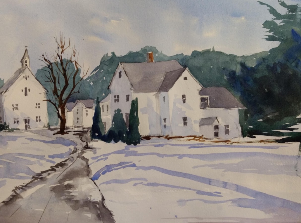
First – my disaster:
[/av_textblock]
[av_image src=’https://kessleronart.com/wp-content/uploads/2019/01/NewBoston1.jpg’ attachment=’469′ attachment_size=’full’ align=’center’ styling=” hover=” link=” target=” caption=” font_size=” appearance=” overlay_opacity=’0.4′ overlay_color=’#000000′ overlay_text_color=’#ffffff’ copyright=” animation=’no-animation’ av_uid=’av-jqsh1kuk’ admin_preview_bg=”][/av_image]
[av_textblock size=” font_color=” color=” av-medium-font-size=” av-small-font-size=” av-mini-font-size=” av_uid=’av-jqsh51fc’ admin_preview_bg=”]
I’m sure the list is long regarding the problems with this picture. I have identified what I see as some of the largest problems in the next image with a detailed explanation below.
[/av_textblock]
[av_image src=’https://kessleronart.com/wp-content/uploads/2019/01/NewBoston1WithText.jpg’ attachment=’471′ attachment_size=’full’ align=’center’ styling=” hover=” link=” target=” caption=” font_size=” appearance=” overlay_opacity=’0.4′ overlay_color=’#000000′ overlay_text_color=’#ffffff’ copyright=” animation=’no-animation’ av_uid=’av-jqsh6bup’ admin_preview_bg=”][/av_image]
[av_textblock size=” font_color=” color=” av-medium-font-size=” av-small-font-size=” av-mini-font-size=” av_uid=’av-jqshlm7w’ admin_preview_bg=”]
- A very ugly tree. This is just a problem of technique, but I do believe the color is not good. I did not consider my palette before painting. Orange is the complement of blue and consequently the tree really contrasts the sky. This gives it too much emphasis and takes confuses the center of interest.
- One thing I learned from Keiko Tanabe was to keep an eye on my transitions. I think in this location I jump a couple of values and once again create a contrast that makes things confusing and pulls attention way over to the right side of the picture.
- I think the value is too dark. This relates to number 2.
- The road leads off towards the church. This is more like the reference photo but leads the eye in the wrong direction.
- The reference also had a bunch of bushes along the road. I felt obligated to put them in, but in doing so i overloaded the left side of the picture with yellowy orange and reinforced the pointing to the left.
How to Improve
As I stated earlier, a core reason for these problems was my attempt to operate a level 4. Couple that with being too tired or lazy to make a plan and there you have it…kindling.
So what are a few things that I should have done to help me on my way (please note that I had done a value study that did help me get as far as I did…here it is:
[/av_textblock]