[av_one_full first min_height=” vertical_alignment=” space=” custom_margin=” margin=’0px’ row_boxshadow=” row_boxshadow_color=” row_boxshadow_width=’10’ link=” linktarget=” link_hover=” padding=’0px’ highlight=” highlight_size=” border=” border_color=” radius=’0px’ column_boxshadow=” column_boxshadow_color=” column_boxshadow_width=’10’ background=’bg_color’ background_color=” background_gradient_color1=” background_gradient_color2=” background_gradient_direction=’vertical’ src=” background_position=’top left’ background_repeat=’no-repeat’ animation=” mobile_breaking=” mobile_display=” av_uid=’av-9m1wb’]
[av_textblock size=” font_color=” color=” av-medium-font-size=” av-small-font-size=” av-mini-font-size=” av_uid=’av-jp4oylua’ admin_preview_bg=”]
A few ideas on fixing a failed painting…
This takes courage….to publish a failure. I am actively soliciting input should any artist visit this page and be willing to take the time to help! I was looking at a bunch of John Yardley’s paintings and admiring the city views, his wonderful paintings of buildings. So simplified, but wonderfully connected with extraordinary composition.
It inspired me to attempt a city scene.
Here is my reference image so that you can see the source.
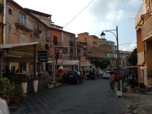
As you can see, this is a very complex image. Here are my initial impressions of what I needed to do:
- Simplify – very complex, too many shapes, far to much to cram into a 12 by 16 painting.
- Poor light – this is a constant problem for me. I take photographs, but I can’t control the weather. This was a grey day and mid-day to boot…no shadows, very little play of light in the dark photo. Can I successfully introduce light, shadows, contrast? I certainly didn’t this time around.
- Perspective – especially with cars. Cars are simple, but I struggle mightily with them. Color is also a problem…choosing the best color for a car to not overstate it, but still keep it interesting…tough!
- What to do with the transitions from the buildings to the street. This is a constant issue for me. I study artists. In this case, I looked a John Yardley’s work. He seems to use hard edges and combinations of similar tone and then other times different tones. Knowing when and where is what makes him great!
- Stay loose
So how did I do?
Not so well…
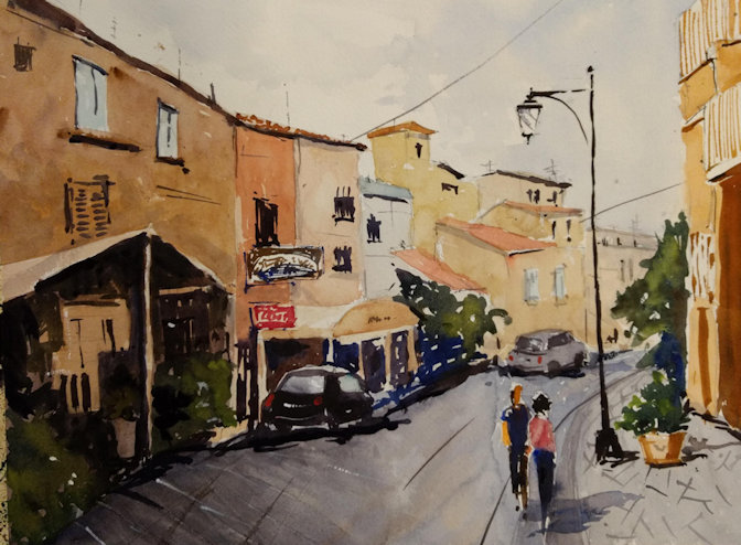
Here are what I see as issues:
- Depth is missing. I tried to lighten the receding buildings but it didn’t work. The picture still seems flat.
- Many artists fill in spaces at ground level along rows of buildings with ‘stuff’, that is, nothing specific…just shapes that may imply things, but nothing specific. The area beneath the large awning was and attempt, but just didn’t work.
- The transition from building to street really doesn’t work. I tried a dark to connect things together, but it looks very unnatural and artificial.
What I can try to improve this:
- Shadow left building on the at top of canopy to try to give more depth and pop to canopy.
- Lighten dark strip along the pavement and replace with something more interesting.
- Work on distant car.
- Darken foreground, warm it up to try to give more depth.
- Make a curb along the right side to interest.
Initial painting…
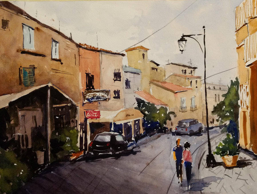
The following image reflects the changes….did it help?
[/av_textblock]
[/av_one_full]